Why have you removed the weekly chart from Result page?

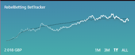
I’m talking about this little chart on the top left corner when you go to results page, the weekly chart allowed me to asses the CVL but with weekly not showing anymore it’s now pretty much useless. please bring it back

Edit: I understand there’s a longer way to get to these results via going into reports, then changing the graph etc etc but they used a smoothed line on that graph which does not help me, whereas on the chart on the results tab it’s not smoothed out allowing me to see the negative CLV bets, even the tiny ones, I can’t do that anymore. Which is seriously going to negatively effect my experience, I know it’s probably been removed for noobs chasing short term riches to try keep them on board longer, I get it’s a business but us experienced traders/bettors used this as a valuable tool for short term changes to settings.

opera_oNYo3u8VwI

You can still see the weekly when clicking on the reports button, then just check the last 7 days

oh yes I know that, but I mean from an instant point of view, having to go into reports isn’t instant like just clicking one button (results).

Also the reports view is not as detailed as the CLV line on the results tab, you can see each singular tiny event, especially the negative ones which I;m looking for, the line is too smooth here to make any educated judgment in the “short term”

I’d like to see it come back as well. Find it useful getting into the micro detail. I get the science of big numbers but think you should have the option of seeing the weekly detail (not smoothed out). Just have it as an option you need to turn on rather than the original default - or keep it to Pro.